Top 10 Wayfinding & Signage Design Mistakes Businesses Should Avoid
Wayfinding is crucial in every sector, whether it be a retail space, office building, hospital, or campus. Implementing signage and visual cues helps people navigate a space effortlessly, eliminating confusion.
Smart wayfinding design consultants ensure seamless navigation in various environments, but many businesses don’t understand the importance of having an effective wayfinding and signage system. This results in confused customers who become frustrated and leave, leading firms to lose customers and opportunities.
Early Warning Signals of Ineffective Signage Design
When designing their signage, many businesses make the same mistakes, even with the best of intentions. The following five warning signs suggest that your signage might be doing more harm than good:
Unclear Messaging signs that take more than a few seconds to read or interpret.
Inconsistent branding occurs when visitors are confused by mismatched typefaces, colors, or design styles.
Overly Complicated Language using jargon or too many words instead of simple directions.
Poor Visibility signs that are too small, hidden, or poorly lit.
Outdated Information, old maps, incorrect directions, or missing digital integration.
10 Common Wayfinding & Signage Design Mistakes
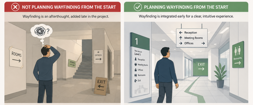
1. Not planning Wayfinding from the Start
Wayfinding is often neglected, which leads to confusing layouts and inefficient navigation. Insufficient signage planning can make it hard for users to move intuitively through the space.
As a result, there are frequent directional errors and an increased need for assistance. Integrating wayfinding early creates a smoother, more user-friendly experience.
Including wayfinding design consultants during the planning phase will ensure that navigation aligns naturally with the layout, improves flow, and avoids costly adjustments later.
2. Unclear Signage Hierarchy
Users cannot process enough information at once without a clear signage hierarchy. When every sign looks equally important, it becomes difficult to decide what to follow.
A structured signage system, with primary, secondary directional signage, helps guide users step by step. It ensures the most critical information stands out at the right moment.
This reduces confusion and improves navigation flow. A well-defined hierarchy makes the wayfinding system feel more intuitive and less overwhelming.
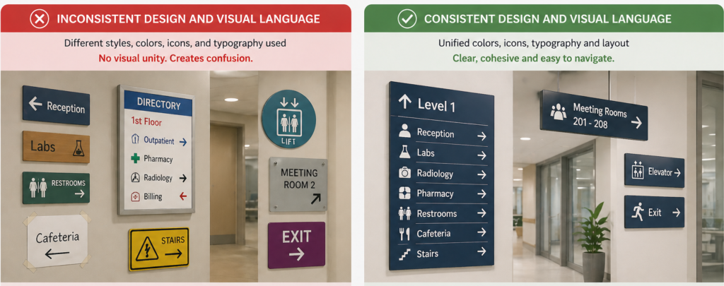
3. Inconsistent Design and Visual Language
The user cannot quickly understand directions when signage is inconsistent in colour, typography, icons, or layout. People rely on visual patterns to navigate, and inconsistency forces them to relearn the system at every step.
This slows down decision-making and increases the chances of mistakes. A unified design language creates familiarity and trust throughout the entire space. Consistency makes it easy for users to guide effortlessly without second-guessing.
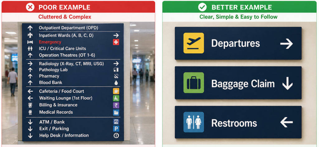
4. Clutter and Complex Signs
Businesses that strive for excessive creativity in their signage often opt for overly intricate or cluttered designs, making them challenging to comprehend within their wayfinding and signage design systems.
While wayfinding aims to provide smooth navigation, such mistakes tend to confuse visitors rather than provide clear directions.
Businesses can avoid this mistake by using readable fonts and universally recognised symbols to make their wayfinding signs simple and easy to understand, thereby helping to prevent such errors.
Also, stick to a consistent colour palette that is eye-catching and aligns with your business’s aesthetic. Professional wayfinding designers can help simplify signage without losing brand identity.
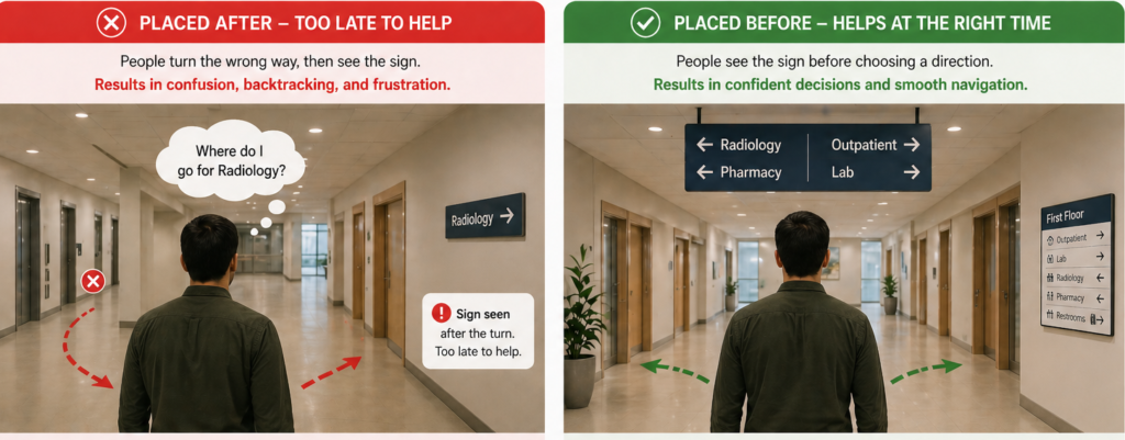
5. Signs Placed after Decision Points
The purpose of wayfinding is lost when signs are added after a user has already reached a decision point. At that stage, people have already chosen a direction, often incorrectly, which can cause confusion and backtracking.
Effective wayfinding is designed to anticipate user movement and provide guidance just before decisions are needed.
This helps users navigate confidently without hesitation. Placing signage at the right time is equally important as the message itself.
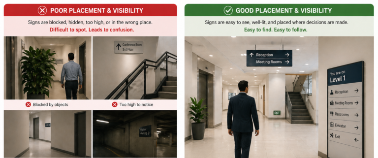
6. Poor Signage Placement & Visibility
Signs placed too high, too low, or in cluttered places frequently go unnoticed. Many businesses overlook the importance of identifying signs at key locations, such as intersections or entryways, which can lead to confusion.
A simple solution is to strategically place signage at eye level and at key navigation points, such as entrances, hallways, staircases, and elevator lobbies. Conducting a walkthrough of your space from a visitor’s viewpoint can help identify the best placement. A skilled wayfinding studio can effectively map this out.
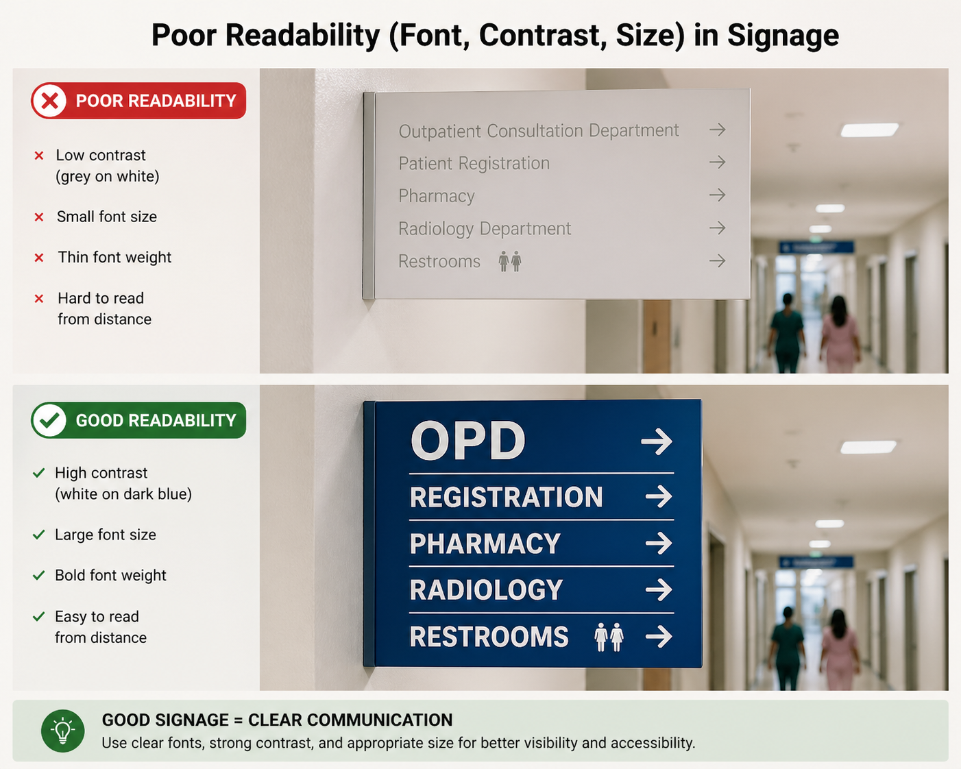
7. Poor Readability (Font, Contrast, Size)
Even well-placed signage fails if it cannot be read quickly and clearly. In fast-paced environments, it’s challenging to process information because of small font sizes, low contrast between text and background, or overly decorative typefaces.
Users need to understand directions without having to stop or strain. How easily people can move around a space is directly affected by readability.
Using high-contrast colour combinations, legible fonts, and appropriate text sizing ensures information is accessible at a glance. Both usability and user confidence can be improved by focusing on clarity rather than style.
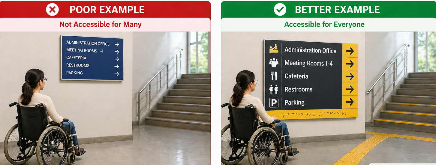
8. Ignoring Accessibility for Disabled Visitors
Neglecting accessibility is a significant error. If the wayfinding system does not accommodate people with disabilities, they may struggle to move around and navigate through an environment.
To prevent this, consider making it essential that your signage system be accessible to all users. Include Braille, tactile signs, and high-contrast colours for the visually impaired individuals.
Additionally, consider the needs of users with mobility impairments by ensuring they have clear paths and directions to elevators, ramps, and accessible entrances. Accessibility is a key focus area for expert wayfinding signage consultants.
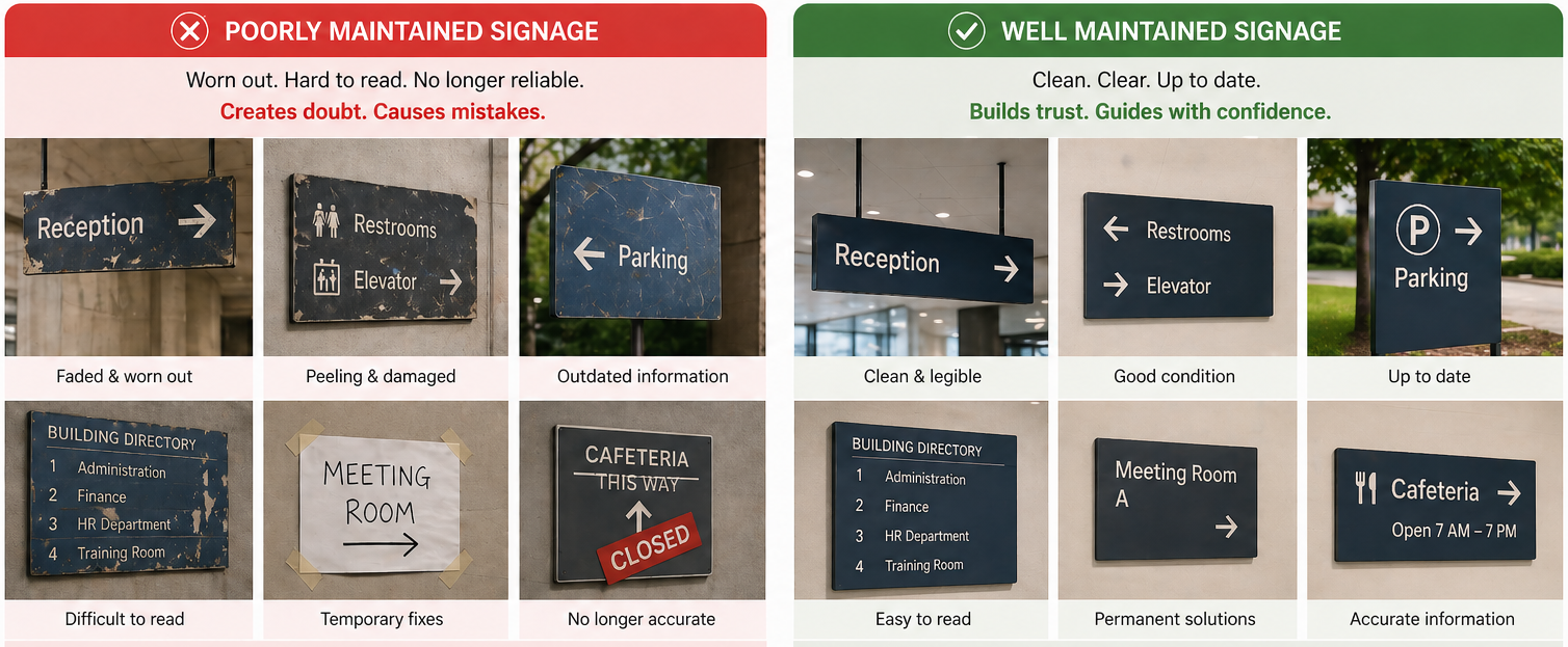
9. Failing to Maintain Signage Over Time
Signage can deteriorate, get dirty, or become outdated over time. Failing to maintain your wayfinding (navigation) may result in a poor user experience, damaging the brand’s reputation.
To address this, establish a regular maintenance schedule to keep your signs in optimal condition and prevent customer complaints.
This should involve cleaning, replacing damaged signs, and checking that all the information is accurate. Wayfinding consultants often recommend periodic audits to ensure information and placement remain relevant.
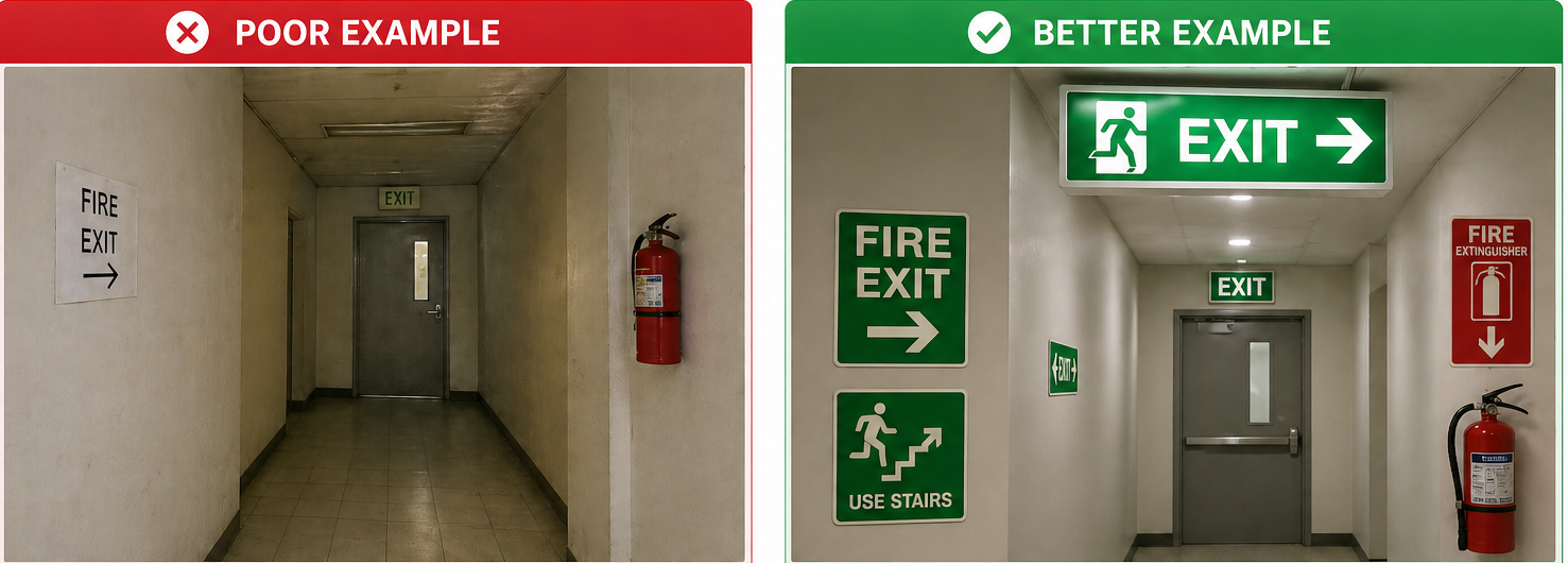
10. Lack of Proper Emergency Signage
Poor emergency signage can pose a high risk to visitors in critical situations. If fire exits, evacuation paths, or locations of safety equipment are not clearly marked, panic and delays can result.
One can prevent this by creating proper, visible emergency signage with easy-to-remember icons. Emergency exits should be easily accessible from any part of your facility to help prevent panic during a critical incident.
Professional wayfinding signage consultants ensure that all emergency signs adhere to environmental wayfinding design principles and meet safety and compliance standards.
How to Audit Your Wayfinding Signage System
If you feel like visitors are getting lost or asking for directions too often, it’s time to take a closer look. A simple wayfinding audit can quickly reveal what’s working and what’s not.
Step 1: Walk the Space Like a First-Time Visitor
Start at the main entrance and move through the space as if you’ve never been there before. Notice where you hesitate, second-guess your direction, or struggle to spot the next sign.
Step 2: Pay Attention to Common Questions
Think about what your staff gets asked most often. If people constantly ask, “Where’s the restroom?” or “How do I get to reception?” your signage may not be doing its job.
Step 3: Spot the High-Confusion Areas
Entrances, elevators, staircases, hallways, and lobbies are common trouble spots. Check whether directions are clear before visitors reach these decision points.
Step 4: Check Emergency Routes
Make sure exit signs, evacuation maps, and safety markers are easy to see and understand. In an emergency, clarity matters most.
Step 5: Review Accessibility
Confirm that your signage meets ADA and local regulations. Look at contrast, mounting height, braille, and accessible route indicators.
A thoughtful audit doesn’t have to be complicated, and often, small adjustments can make a big difference in how confidently people can navigate through your space.
Expert consultants analyze visitor behavior, optimize signage placement, and create a strategy that aligns with your business goals.
Keystone Sign Studio is a leading wayfinding and signage design consultant in Mumbai specializing in creating intuitive, accessible, and visually appealing wayfinding systems.
Contact us today to arrange a consultation and take the first step toward a smarter, more efficient wayfinding system!
wayfinding system!
FAQs (Frequently Asked Questions)
What are common wayfinding design mistakes?
Common mistakes include poor placement, unclear hierarchy, cluttered messaging, inconsistent terminology, lack of accessibility, and outdated information.
How do I know if my business has a wayfinding problem?
If customers frequently ask for directions, appear lost, hesitate at intersections, or miss key areas, your navigation system may need improvement.
What are ADA signage requirements?
ADA-compliant signage typically includes raised characters, braille, high-contrast colors, and proper mounting height. Requirements vary by jurisdiction, so consulting compliance guidelines is essential.
How often should signage be updated?
Signage should be reviewed at least once a year. It should also be updated whenever there is a layout change, renovation, rebranding, or service relocation.
When is digital wayfinding necessary?
Digital navigation tools are most effective in large, complex, or multi-building environments where static signage alone may be insufficient.